
OkCupid
I began working at OkCupid in March of 2014. In my time there, I’ve been able to contribute in myriad ways, from tackling the complex UX challenges of expanding our gender and sexual orientation options beyond the binary to an overhaul that made our plentiful match search filters much more digestible. Find a deeper dive into these projects and others below.
Sign Up (or as O’Reilly would title it, Killing Inga)
One of the first projects I tackled at OkCupid was designing a visual refresh of our sign up page that would help modernize the feel of the site without hurting conversion. Our sign up page was a delicate flower. It received over 1.9M visits per day, yet it only converted roughly 1.5% of those visits into new users. Nearly all of our designers had taken a stab at improving signup and failed; those prettier redesigns couldn't match the success of control. We all believed the culprit was Inga.
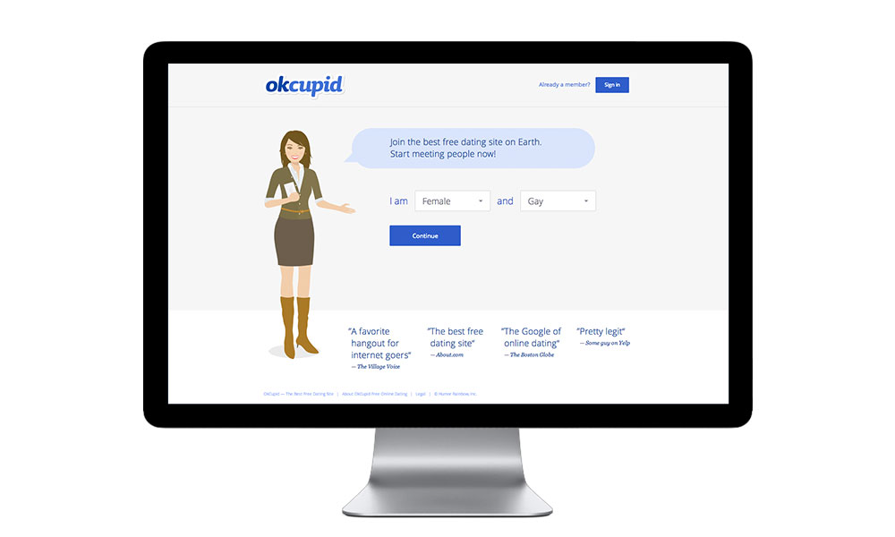
Yep. That’s Inga. I know. We, designers, all hated her. Her presence made the site feel old and cold — like you’re signing up for Second Life, not a dating site chock full of real live humans.
After studying the failed attempts we had tried, my strategy was simple. Let’s keep nearly everything but Inga the same and see if we can just get rid of her. It’d be an incremental improvement but one we’d count as a win.
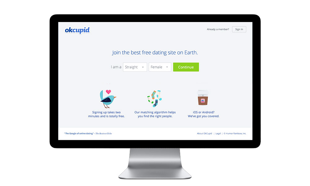
And a win it was. Sign up conversion improved by about .25%, which is an addition of about 145K new users/month. That's nothing to sneeze at. And, of course, with Inga dead and gone — the team rejoiced.
“Big win, slugger. You've permanently written yourself into the OkC history books.” Michael, front end dev
“Never thought I'd live to see the day.” Courty, designer
Coming from agency life, this was my first real challenge in the world of in-house product design and as such I learned a helpful lesson. When it comes to trying to make changes to a sensitive part of your product, small iterative changes are the way to go. Adjust little things and test in an A/B manner. This will allow you to isolate what the users respond to, and proceed accordingly.
Beyond the binary
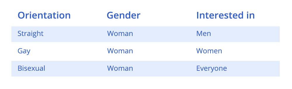
For years we’d received user feedback begging us to expand our gender and orientation options. We finally got the chance to remedy this issue, and I was the lead designer tasked with figuring out how it would all work. It was my job to introduce the complexity of a plethora of new gender and orientation options without complicating the experience of the typical (i.e. straight) user.
From the start, one technical limitation would have to guide our solution. We simply didn’t have the back end resources to rewrite a true non-binary solution. We’d be forced to map our users to the existing gen’tation (gender + orientation) tables. Therefore, our solution must give the appearance of a respectful non-binary experience on the front end while still tying in to a back end successfully enough to show any user, regardless of gender or orientation, the matches they want to see.
Originally, I thought we'd have to get the user to complete this statement.
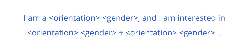
I quickly realized that was far too convoluted. Essentially, we only needed to discern two key data points for the system to work. 1) What gender should we classify you as? 2) Do you want to meet men, women, or both? With those answers leading the way — orientation simply becomes a detail. This epiphany led to a much cleaner statement.

For some users, this didn’t change anything. If your answer to this question fit within our old set of options, then we can still logically infer who you are interested in.
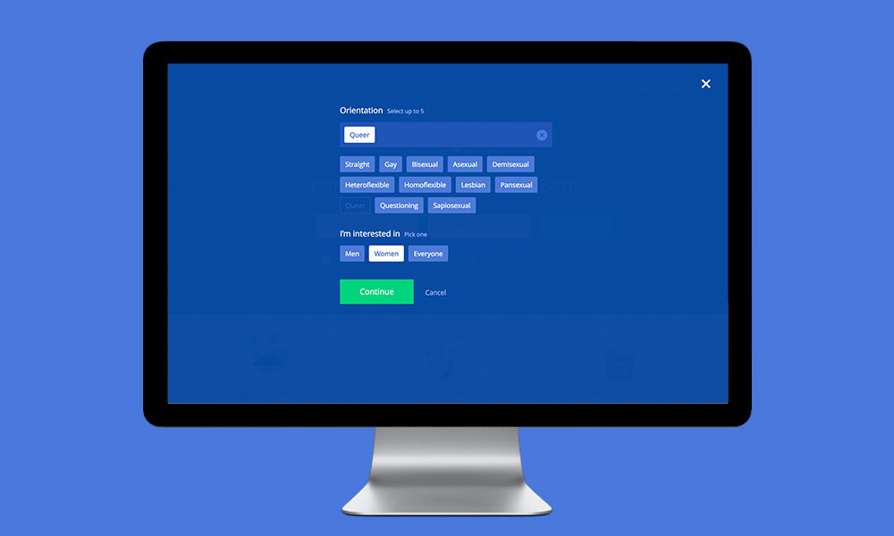
Once you select an orientation for which we can’t infer who you are interested in, then we need to ask you a few more questions. Since we allow you to select up to 5 orientations, you are free to choose 2 or more that logic may find to be contraditory. To mitigate this we made a rule that when a user selected anything outside the original range (gay, straight, or bi) or selected multiple terms within that range, we would simply need to ask them one extra question.
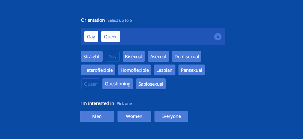
Regardless of what they set their orientation to read, their answer to this question (combined with their underlying gender) would allow us classify them in the back end as gay, straight, or bisexual.
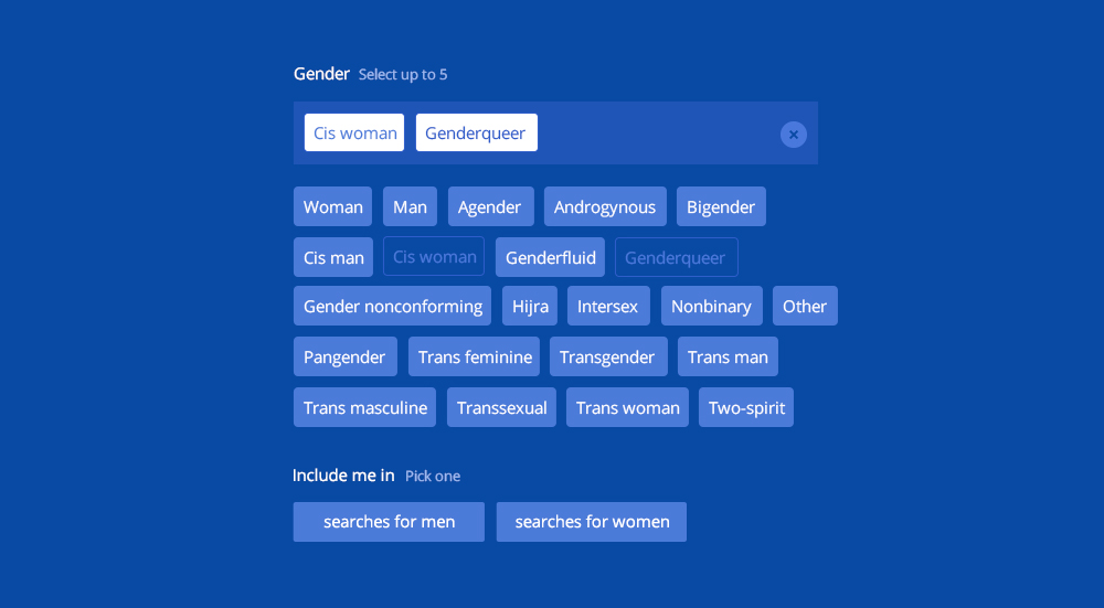
The same tactic was utilized for determining one's underlying gender. If you select a gender outside our means of knowing how to classify you, we ask you to classify yourself. (We are aware this is far from ideal, one could even say "kind of shitty," but given the technical constraints it was the best we could do.)
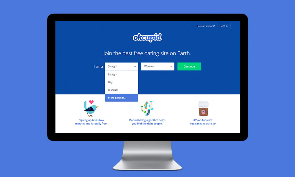
Since one could easily be overwhelmed by all the new options, we kept the front page of sign up streamlined and simple for "typical" users.
Once the user selected "More options" in either dropdown, we'd load an overlay with all the new respective options. The overlay gave us plenty of real estate to work with, and the X, cancel and ESC button key controls would give a curious, yet quickly overwhelmed "typical" user an easy out.
Check it out yourself, if you'd like.
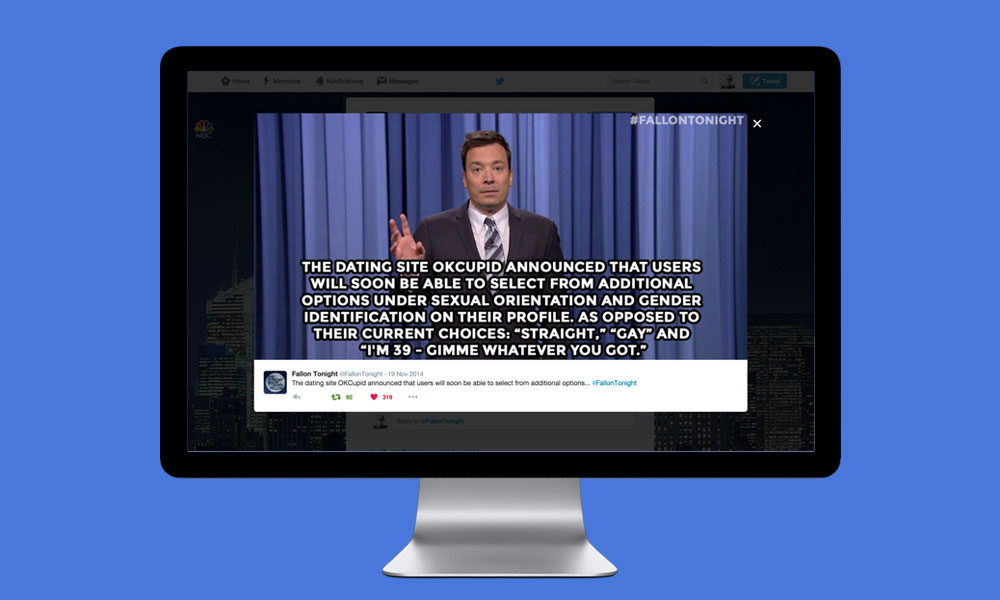
Evidently the public was more eager for this change than we realized. Once this was launched to a test group of 1/16 of new signups, the press caught wind and ran with the story. The rollout was mentioned on the front page of the NYTimes and CNN, and picked up by many sites including Time, Huffington Post, the Advocate, the Independent, the National Review, MIC, XO Jane, Engadget, Bustle, and Hello Giggles. Oh, and this was pretty cool.
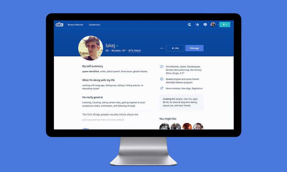
Thankfully, we nailed it on the first try. With signup numbers healthy, we were able to expand this feature globally. All users could now create and edit their profile cross platform with these new expanded options.
And sensing general confusion over some of the more obscure terms, our marketing team launched Identity, a site that allowed our users to explain in their own words what these terms mean to them.
Finally, we stripped the site of he/she pronouns moving to refer to all users as "they," and we amended the search filters to embrace this new expanded system. Which leads us to our next project, search filters.
Search filters
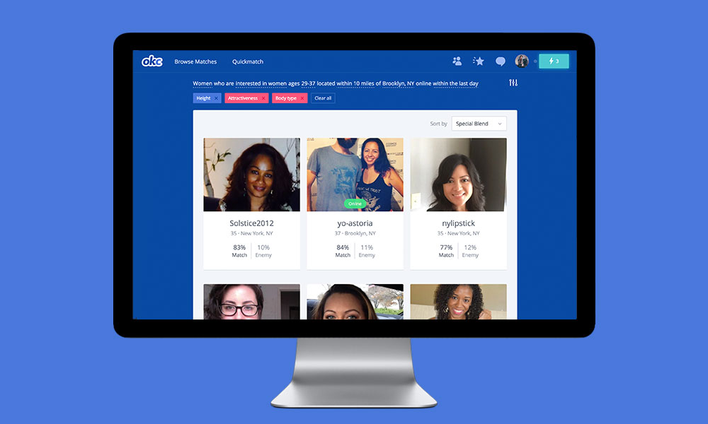
Wow, these were ugly. Search filters were one of the features of the site all us designers wanted to fix. An overly complex, antiquated design — it was due for an overhaul.
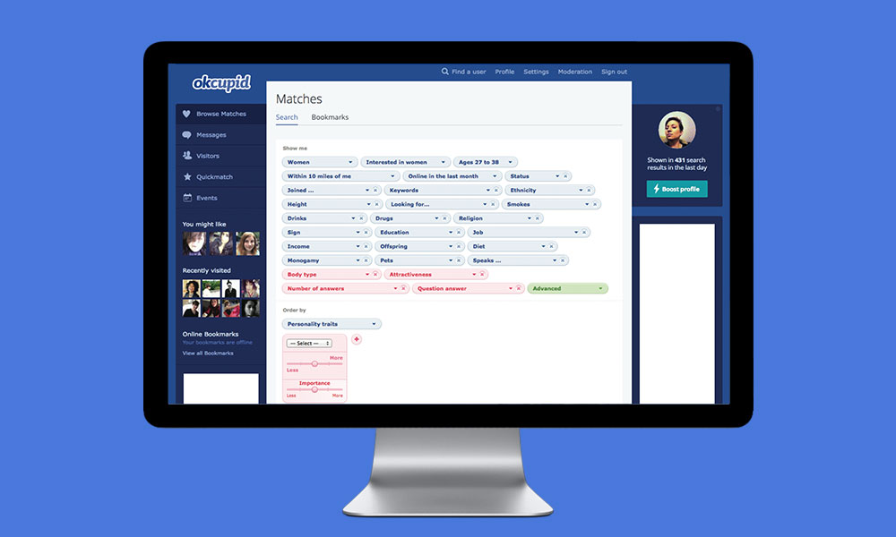
Beyond being ugly, this experience overloaded the user with information. There were 5 basic filters, 23 advanced filters, and 11 ways to sort the results. It was clear we needed to simplify this experience to make it digestible, so I started by jumping straight into the numbers. If any of those filters were rarely used, we could start the clean-up process by cutting the clutter.
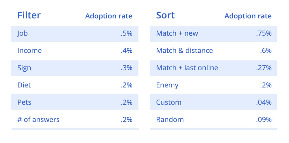
Analyzing the data, I made the case that we should kill the 6 least-used filters all clocking in with a <.5% adoption rate. There were also some fairly pointless sorts that we were hanging on to from the past. Since those sorts were applied to < 1% of searches, I was able to successfully argue for their respective deaths.
After trimming the fat we were left with a hefty, but much more managable set — 6 basics, 18 advanced, and 6 sorts. Typical user behavior guided the decision to keep the basic filters exposed and re-write the code to return live-updated results as you edit.
Next, we sorted the 18 advanced filters into logical groups. This allowed us to create a tabbed structure in which the user could focus their attention on a few filters at a time. We also studied the options inside the filters and killed off certain selections that were redundant or unclear. Then, we parsed what remained to determine what set of interface elements we needed to design to handle all interactions.
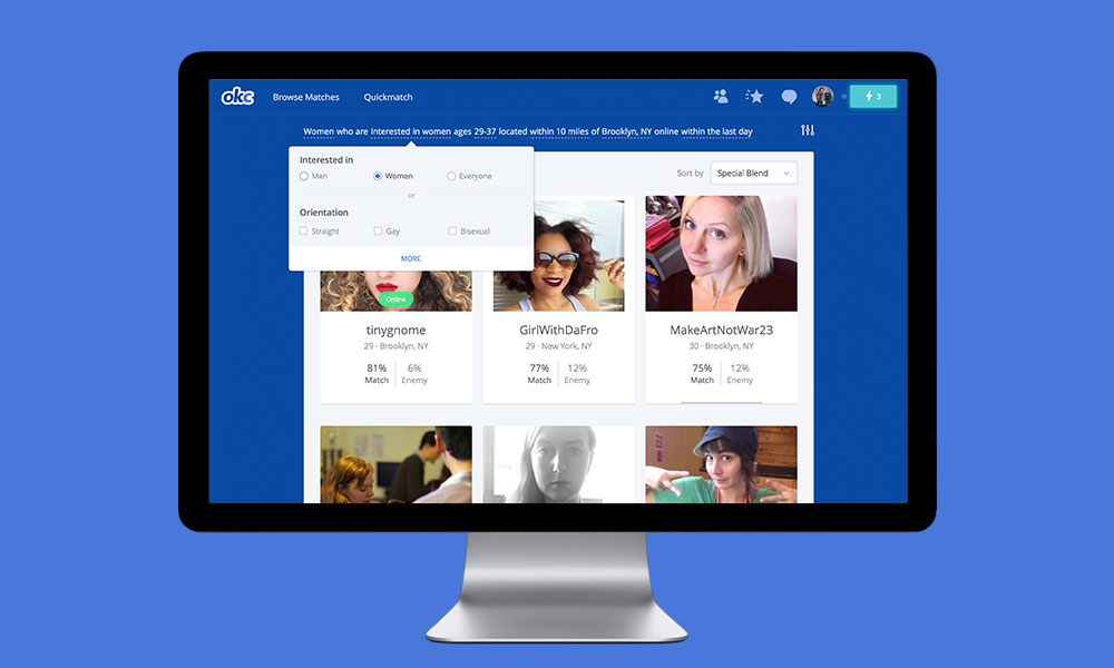
We ordered the tabs based on what was most used. And, keeping monetization efforts in mind, two popular paid filters (body type and attractiveness) led the way. Once a user was happy with their advanced filters hitting Search would commit these changes and display the new results.

Since one can greatly limit returns by being too selective, we designed a tag structure to remind the user at a top-level view what filters were currently on.
Go ahead and check out the interaction design in action.
We launched this conservatively to just 1/32 of our userbase. But watching the numbers, it was a steady success and within a month it was released site-wide to all logged in users.
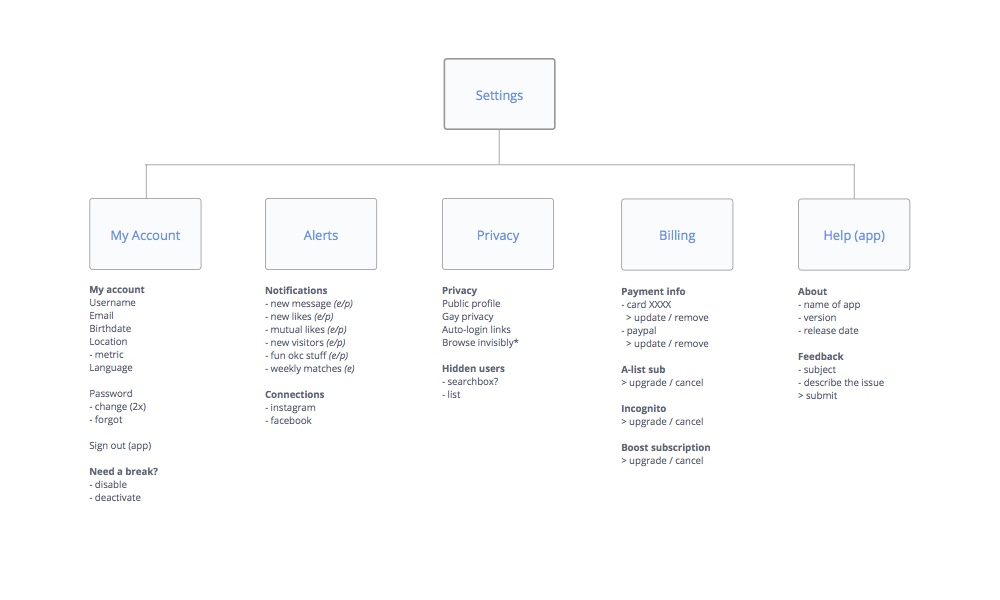
Settings
The most recent project I've worked on at OkCupid is an overhaul of our settings pages. First I did a dive deep into UX to check pre-existing ideas for re-structuring against a new profile design that had just been implemented. I made the requisite changes to that structural plan of attack. Then, after studying the breakdown of what lives where within our existing settings pages, I reorganized that information and built out a few quick wireframes to show my plan for moving forward.
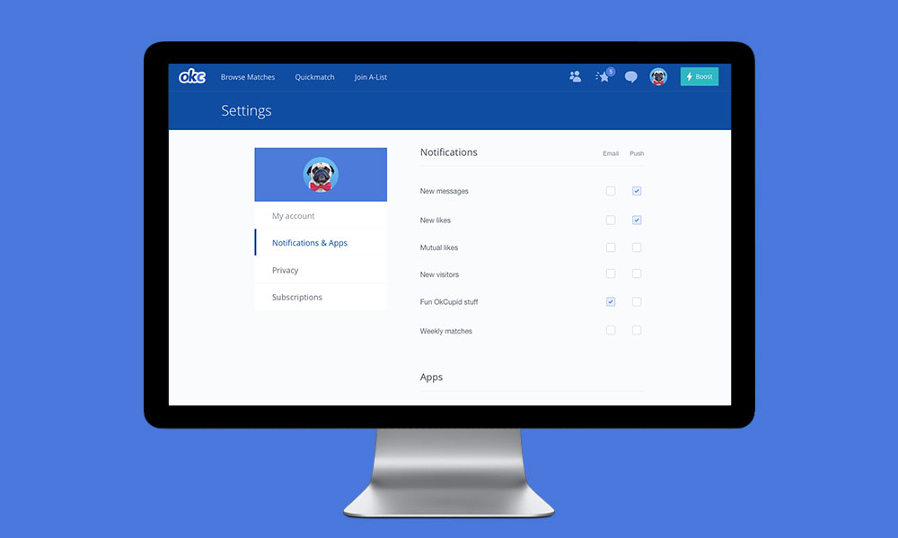
Here is how our existing settings currently look.
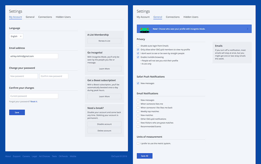
One guiding discovery was that these settings all come pre-established; all the info we need from the user we've learned at sign up. Most users likely navigate to the settings section of the site to change one or two things here or there. This limited interaction allows us to auto-save most actions (just about anything involving a dropdown, checkbox, or toggle).

For text fields, the only instance in which a user could throw an error, we'll load in a Save (and Cancel) CTA once the user clicks into a field. Saving, like this, on a case by case basis seems preferable to putting one Save button far down the page (as it currently exists) where a user could easily miss it.
And for the few instances in which we need the user to re-enter their password to confirm their changes, we'll load in those conditional fields after the user clicks-in. This will allow us to keep the upfront presentation of this page clean and concise.

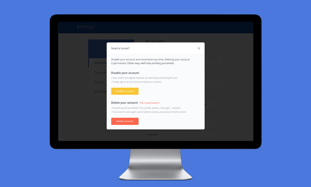
We'll present the user with the differences between disabling and deleting one's account in one place, and we'll reinforce that information with color-coded CTAs; this choice breaks brand standards, but offers valuable at-a-glance information.
For notifications, we can make the experience smarter for users we know have downloaded the app by presenting email and push notification options side by side.
And we can be smarter with the upsells, too. Let's load in the Incognito Mode ad after a user activates certain privacy settings. It's a more considerate upsell once they've shown us they care about their privacy.
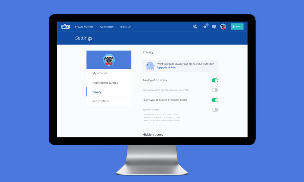
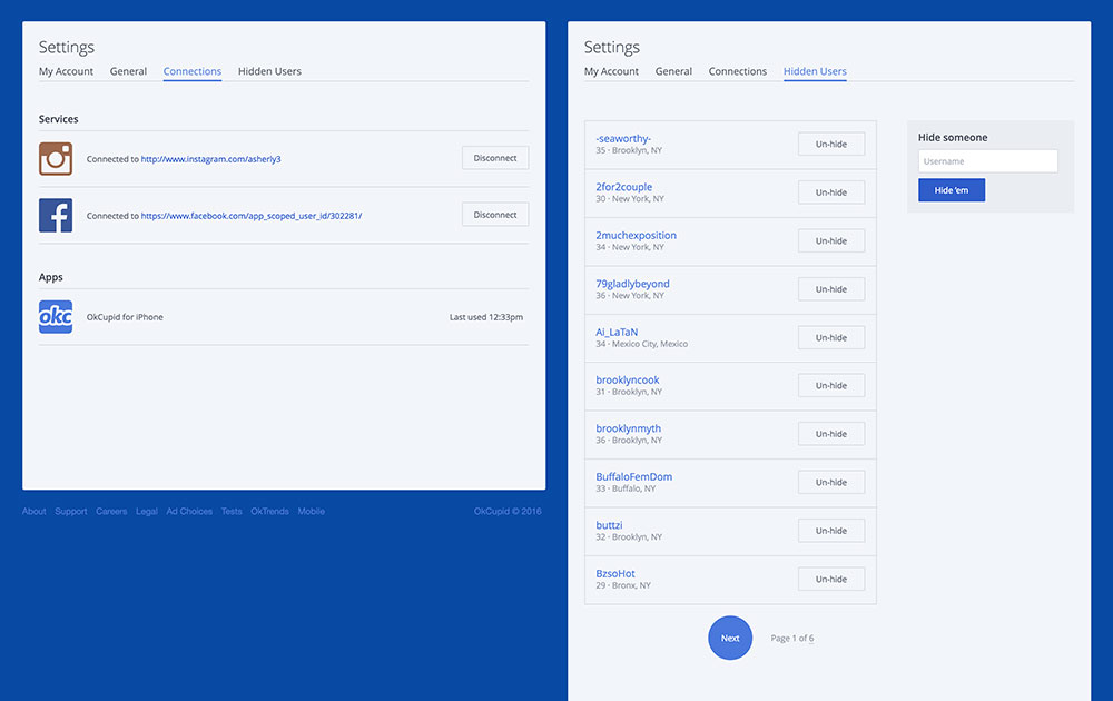
Hidden users doesn't need its own section. Instead, let's nest it under Privacy to keep tabs managable. Most users only hide 3-6 people, so we should default to showing the 5 users you most recently hid and allow you to expand it beyond that.

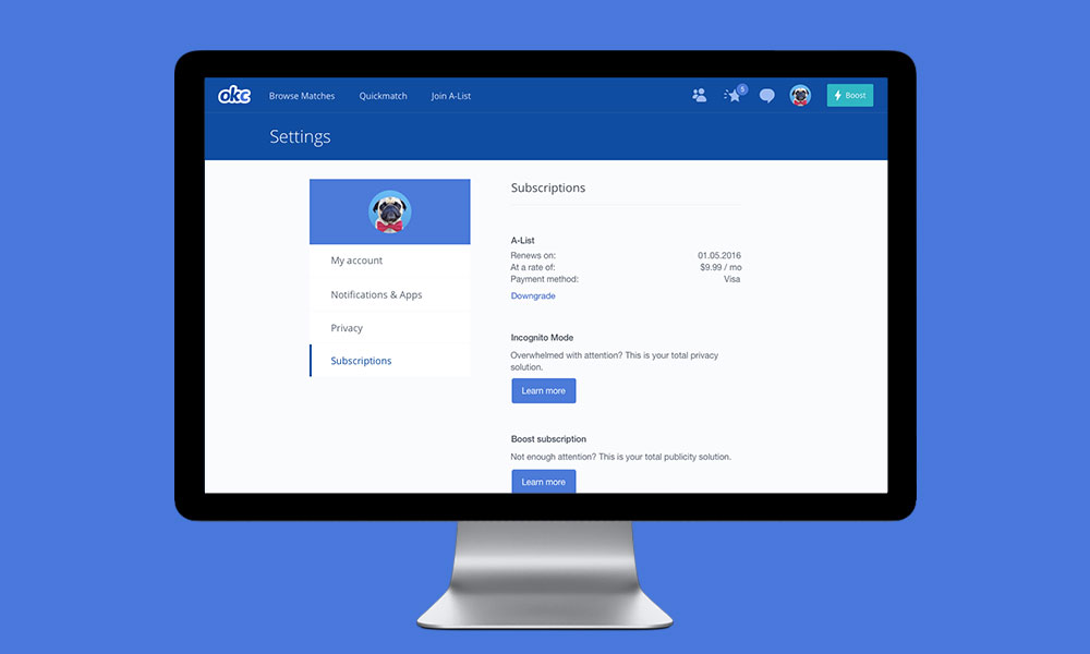
For existing Subscriptions, all the important info you need will be displayed upfront. Should you want to learn more about subscription plans, we'll kick you off to those hard sell pages to give you more information.
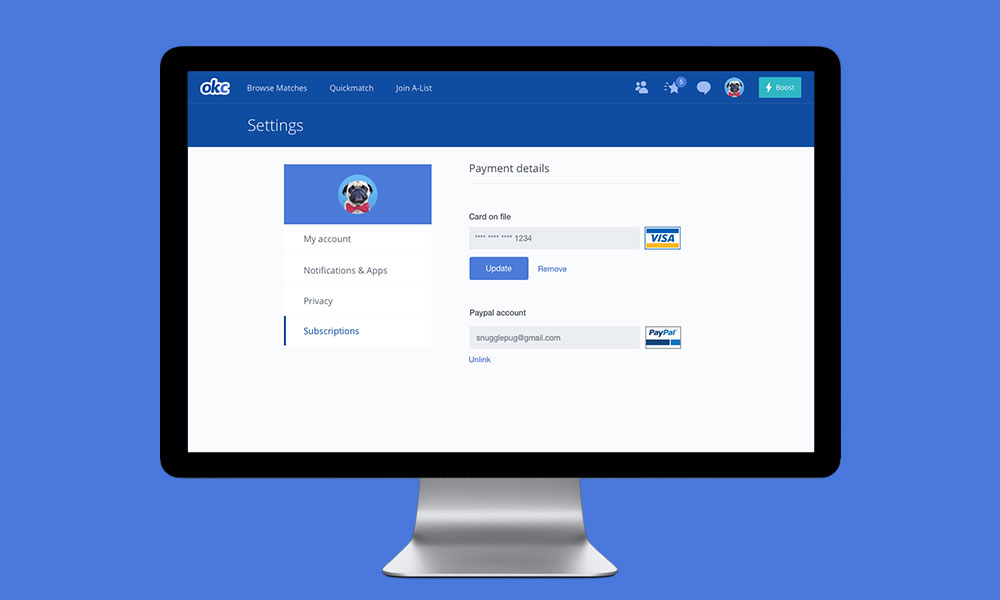
And just downpage, you'll find more info about the credit card you have on file, or the Paypal account you have linked.
We haven't launched these changes yet. But the designs have been approved and back end is about to start the development process. It should be fun to see this up and running in time. Stay tuned.