
Pabst Blue Ribbon
Pabst said, "Our brand is defined by anyone who drinks us," so we created a site to celebrate the drinkers.
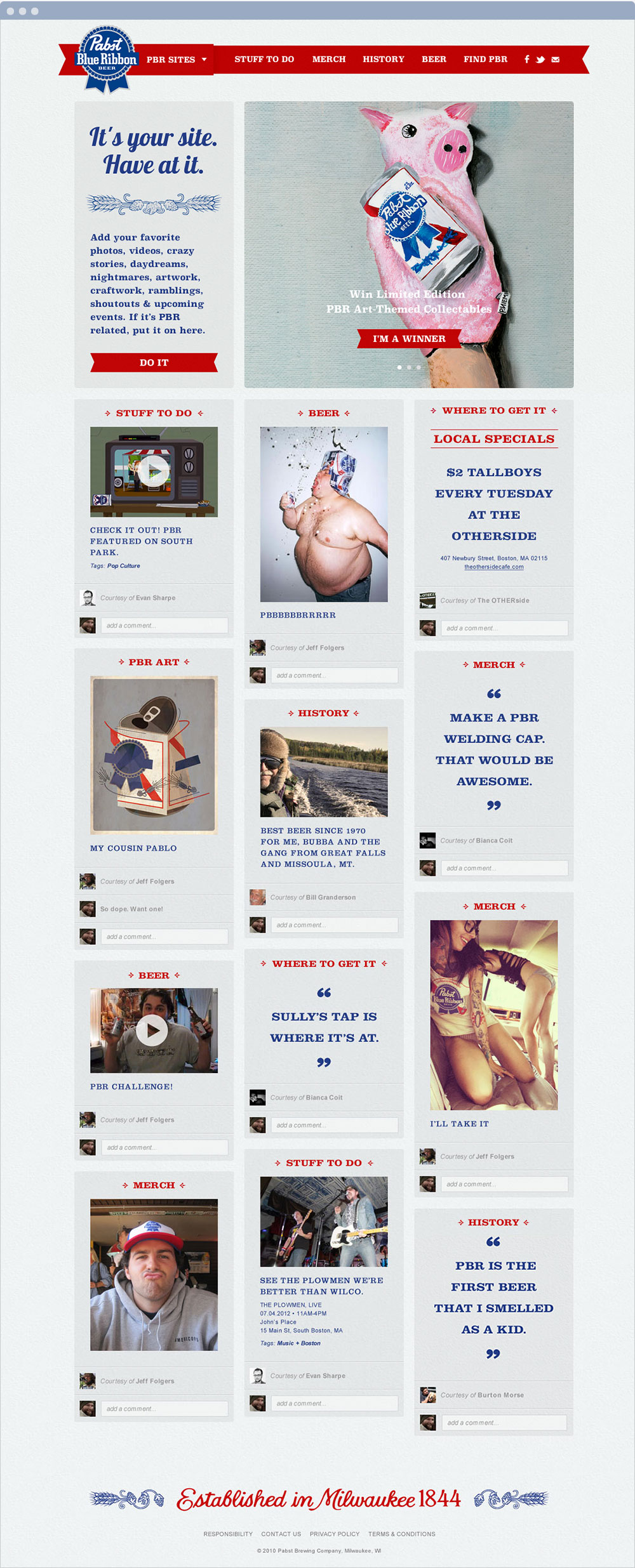
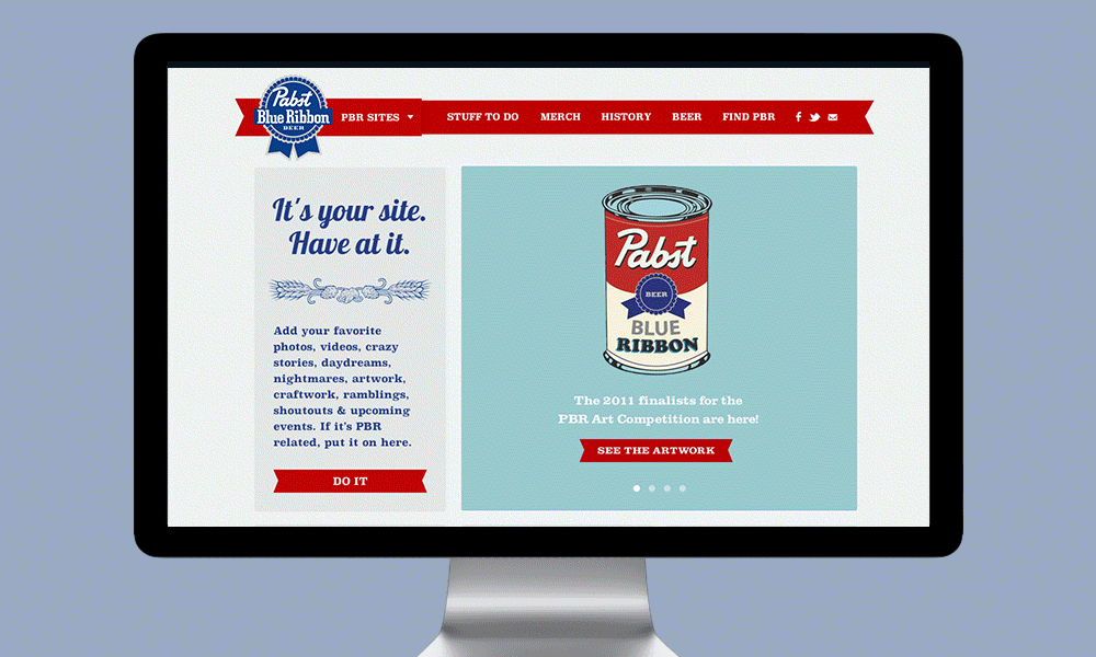
The homepage was comprised of one focused area of client-created promotions, as well as tiles showcasing the 12 most recent pieces of user-submitted content. Design flourishes including font styles, the footer, and button styles were pulled from PBR's iconic packaging.
The animated gif below highlights some unique navigation interactions. My favorite, when you hover over the logo we replace the PBR logo with the profile photos of the most recent contributors to the site.
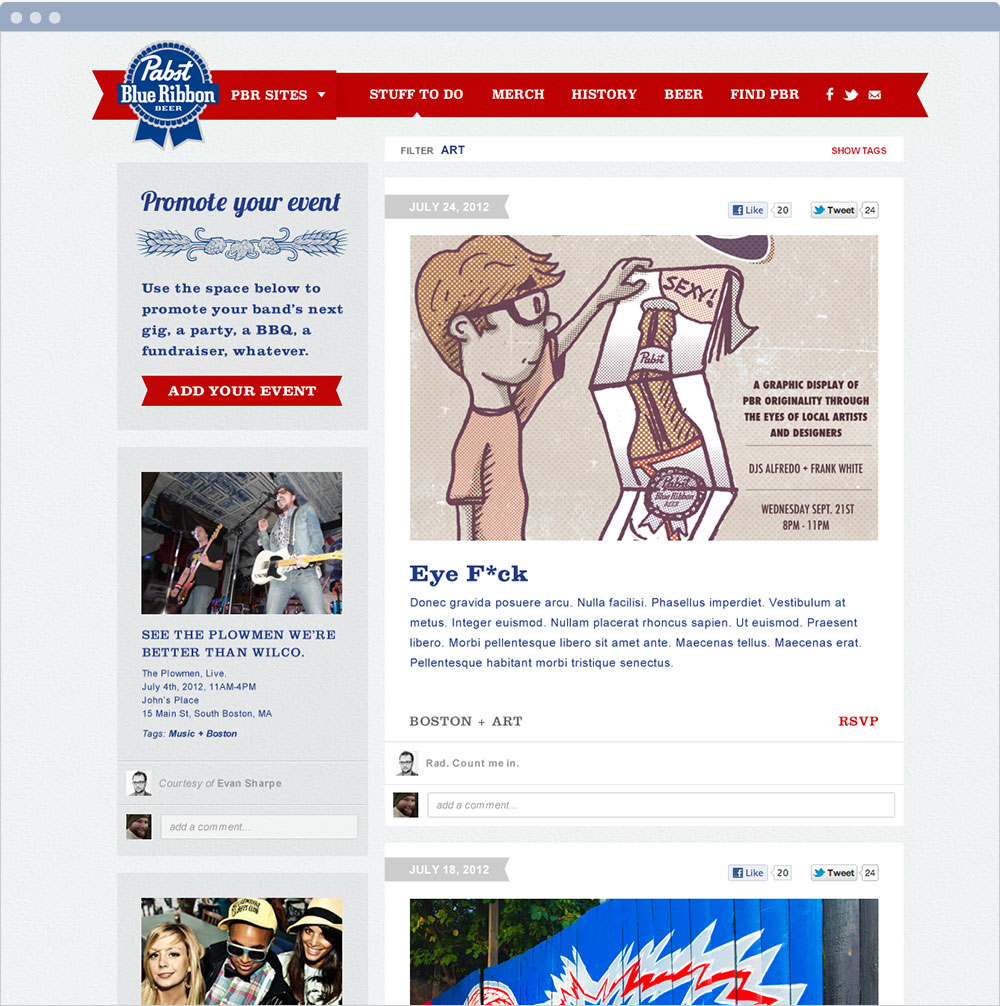
This is the design of the blog page. You'll see throughout the site we carved out the top right spot for any content the brand wanted to push out, while allowing the user-submitted content to fall around that cornerstone.
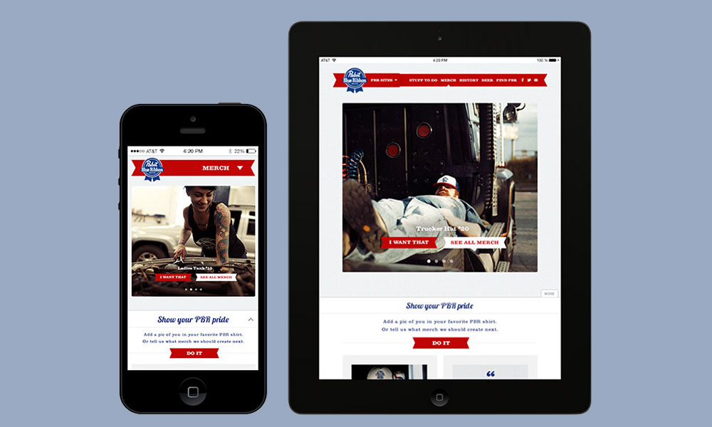
For mobile and tablet versions, that cornerstone owns the top spot in terms of hierarchy. The smaller-screen specific design shifts to allow for a bottom drawer to house all user-submitted content. This creates two layers to each page between which the user can easily navigate.
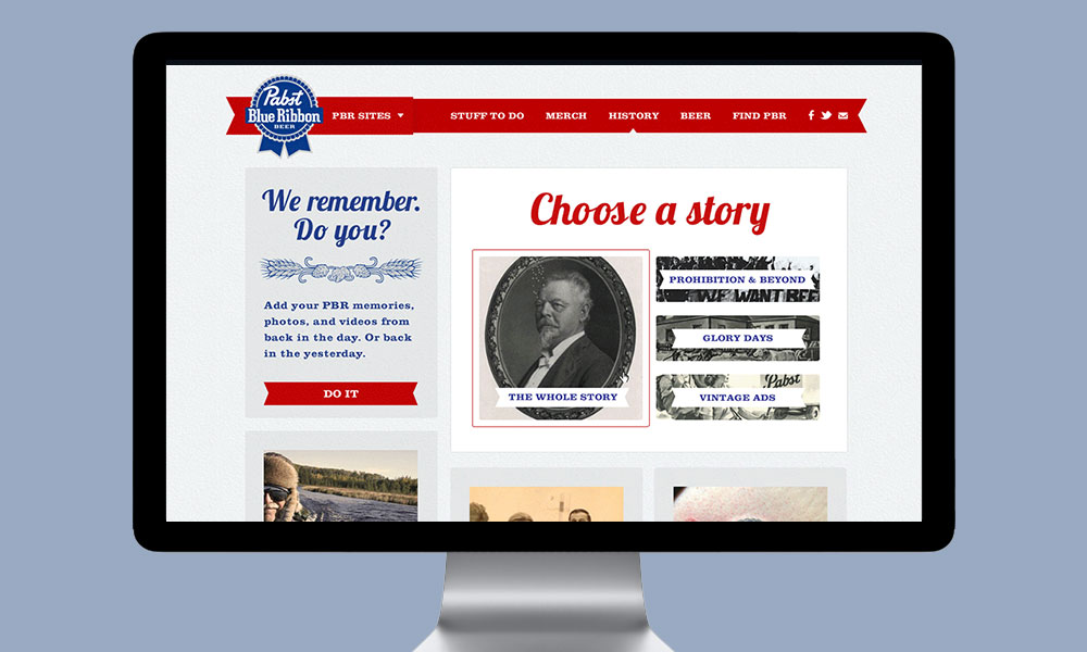
I parsed through a treasure trove of source material cataloguing the significant history of this brand. To make it digestible to the user, I carved out four main stories to tell.
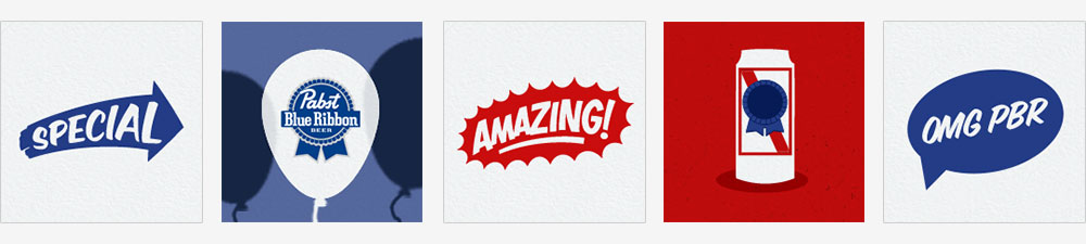
I whipped up some quick designs to accompany the various types of social media posts that would get pushed out from the site.
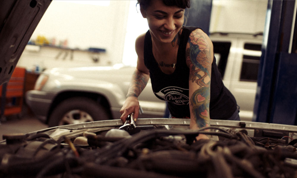
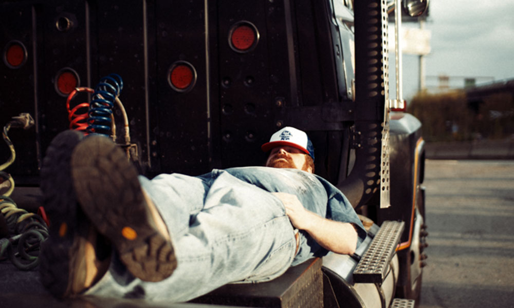
We went above and beyond delivering what the client expected when we took the initiative to produce quick photoshoots showcasing PRB merchandise. We liked the idea of shooting scenes that would play down the merchandise itself while speaking to Pabst's history as a blue collar beer.
And I dug through submissions to PBR art, an ongoing community project, to utilize some of the weirder ones spice up the 404 page.

All Rights Reserved. Ashley Riehlin, 2013.
